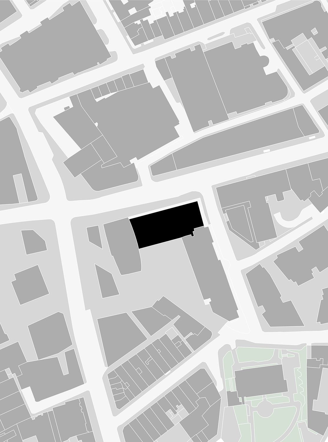
Richard Seifert’s Centre Point in central London was originally designed as part of a traffic gyratory, with vehicles passing below an inhabited bridge linking the tower and a lower-rise element. The Link Building, now Grade II*-listed like the rest of the 1960s complex, has Europe’s largest post-tensioned span, carrying two layers of double-height, open-plan spaces and a roof level above that.
Kajima HQ

 1
1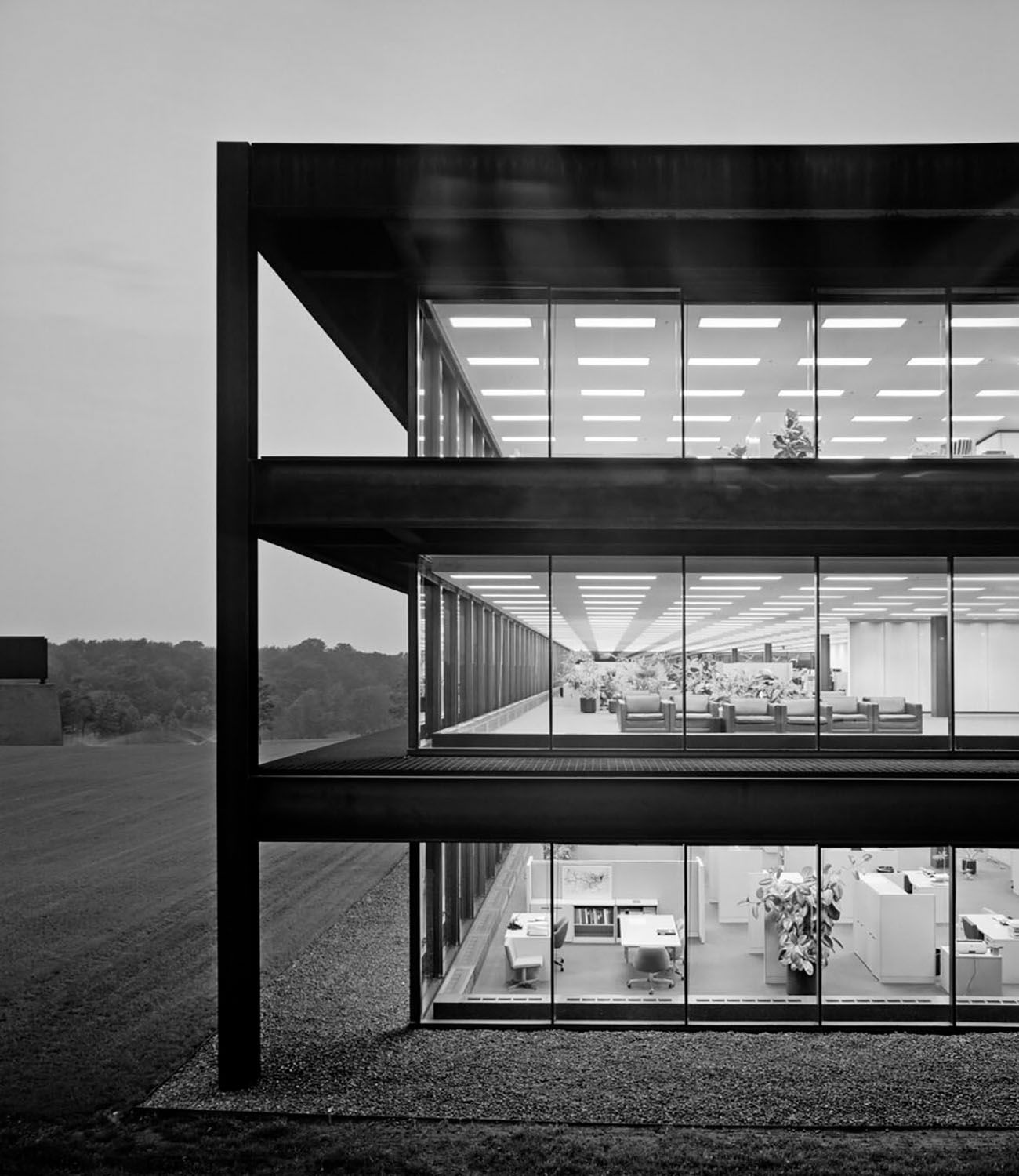 2
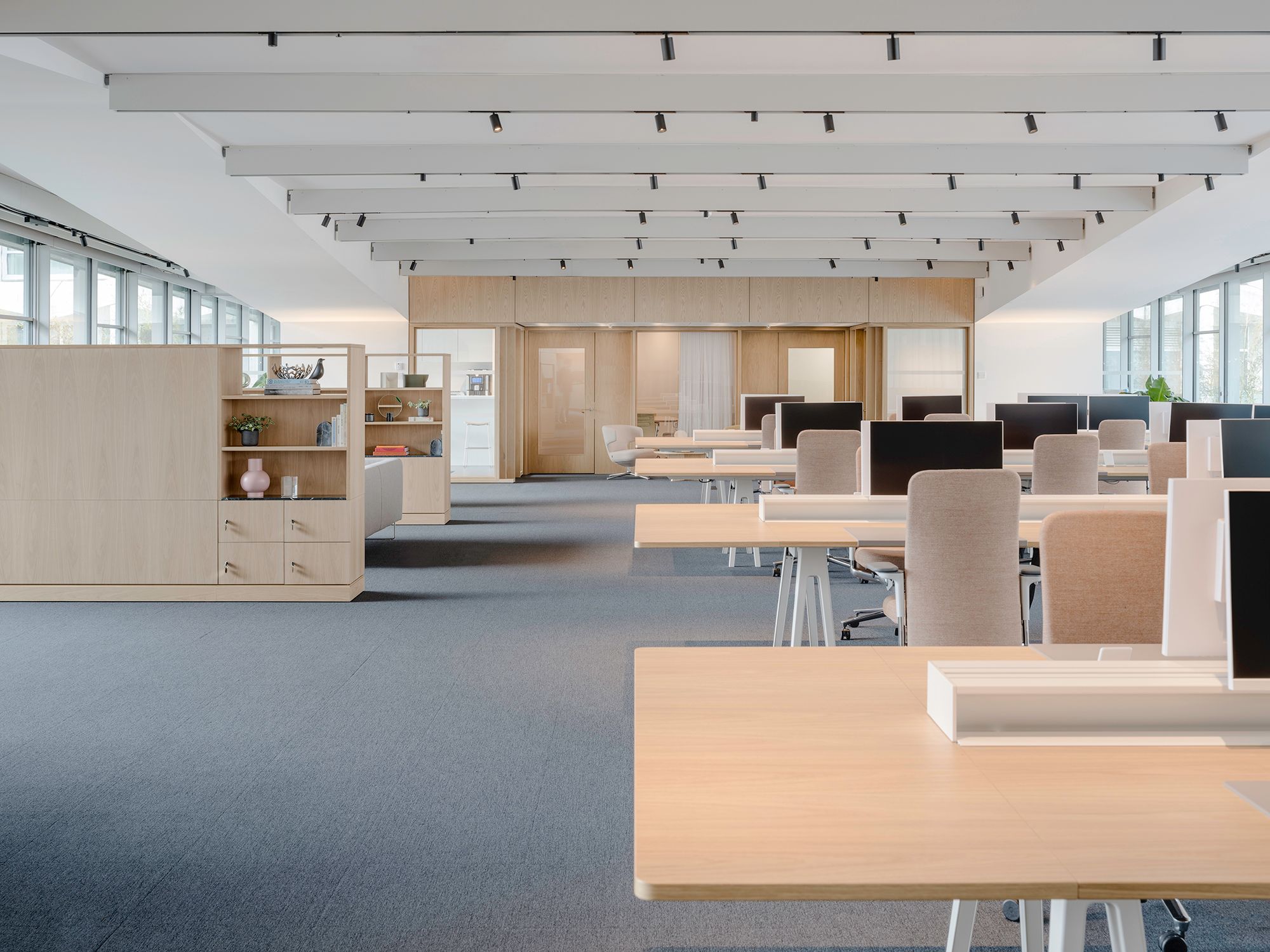
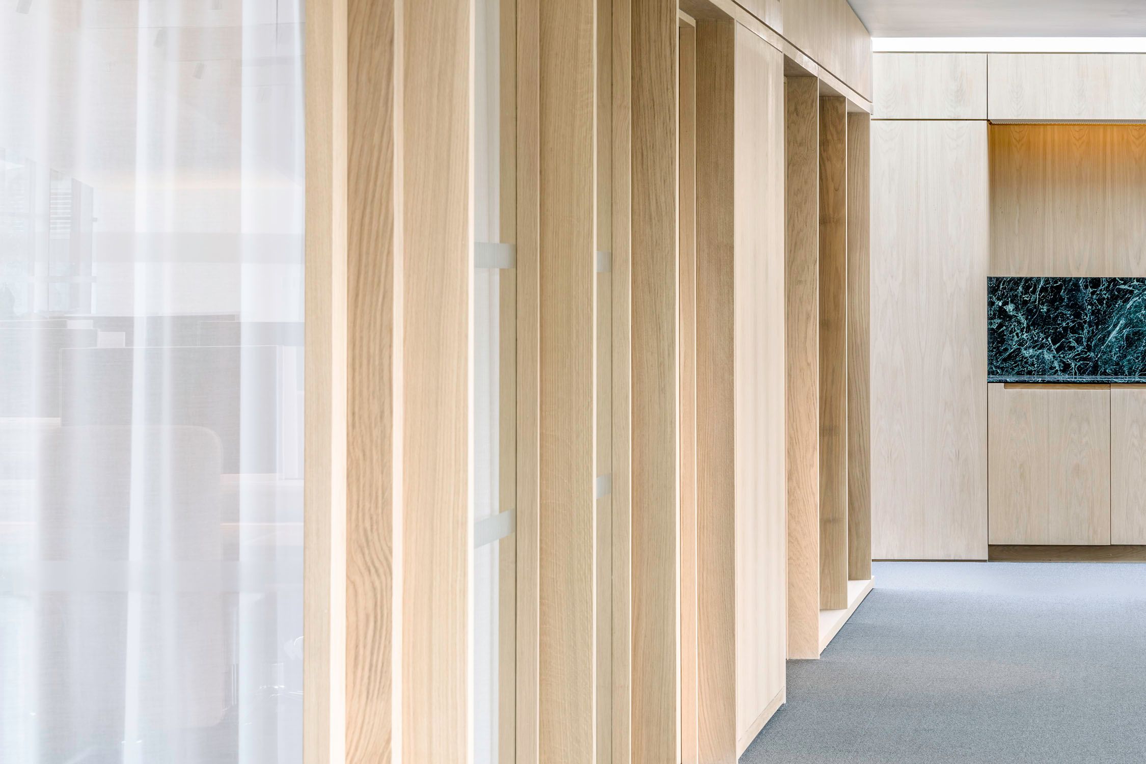
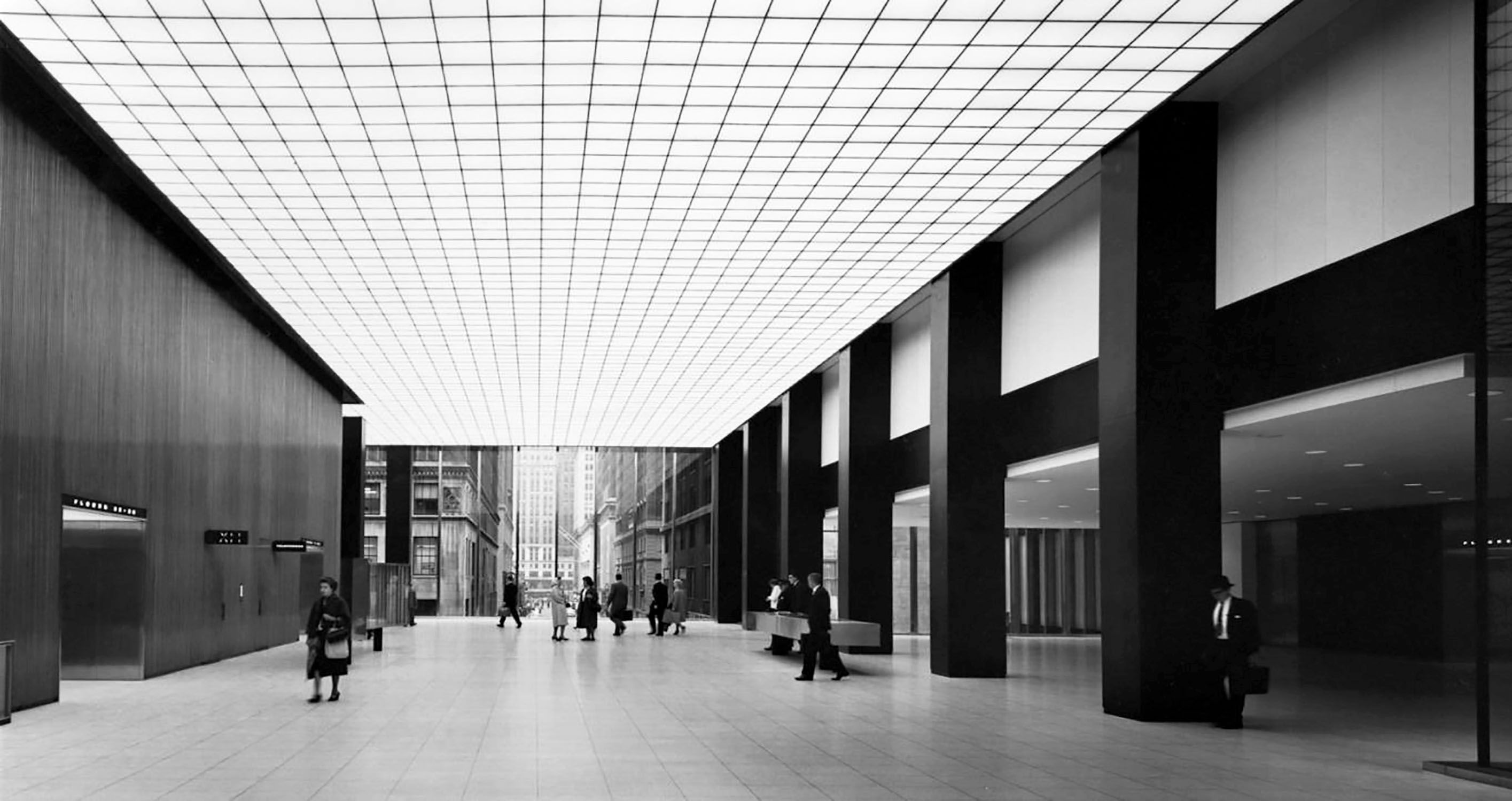
2The interior draws from mid-century offices, reinterpreting a corporate modernism that is rich in its use of materials, texture and the grid.
1 Precision, clarity and drama at SOM’s Union Carbide HQ (1960), as photographed by Ezra Stoller.
2 The Kodak Training Center (1971) by SOM in Henrietta, New York. Photo: Ezra Stoller.
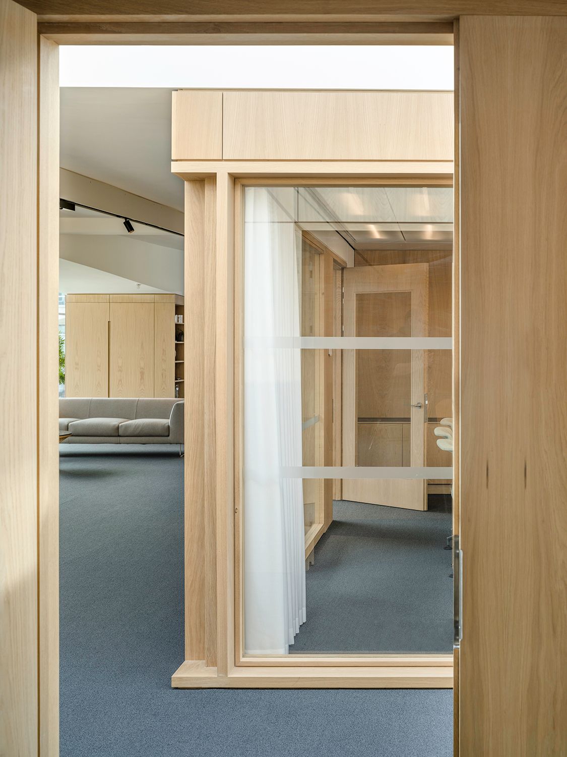
Our client, Kajima, a Japanese-owned developer, had been looking to relocate around 50 staff to a new headquarters. We joined them in testing their brief at various locations in London before arriving at the Link Building. With an initial role to obtain listed building consent and negotiate a change of use for the roof level from restaurant to office, we eventually came to design the headquarters from Cat A on to Cat B, right down to the furniture and cutlery.
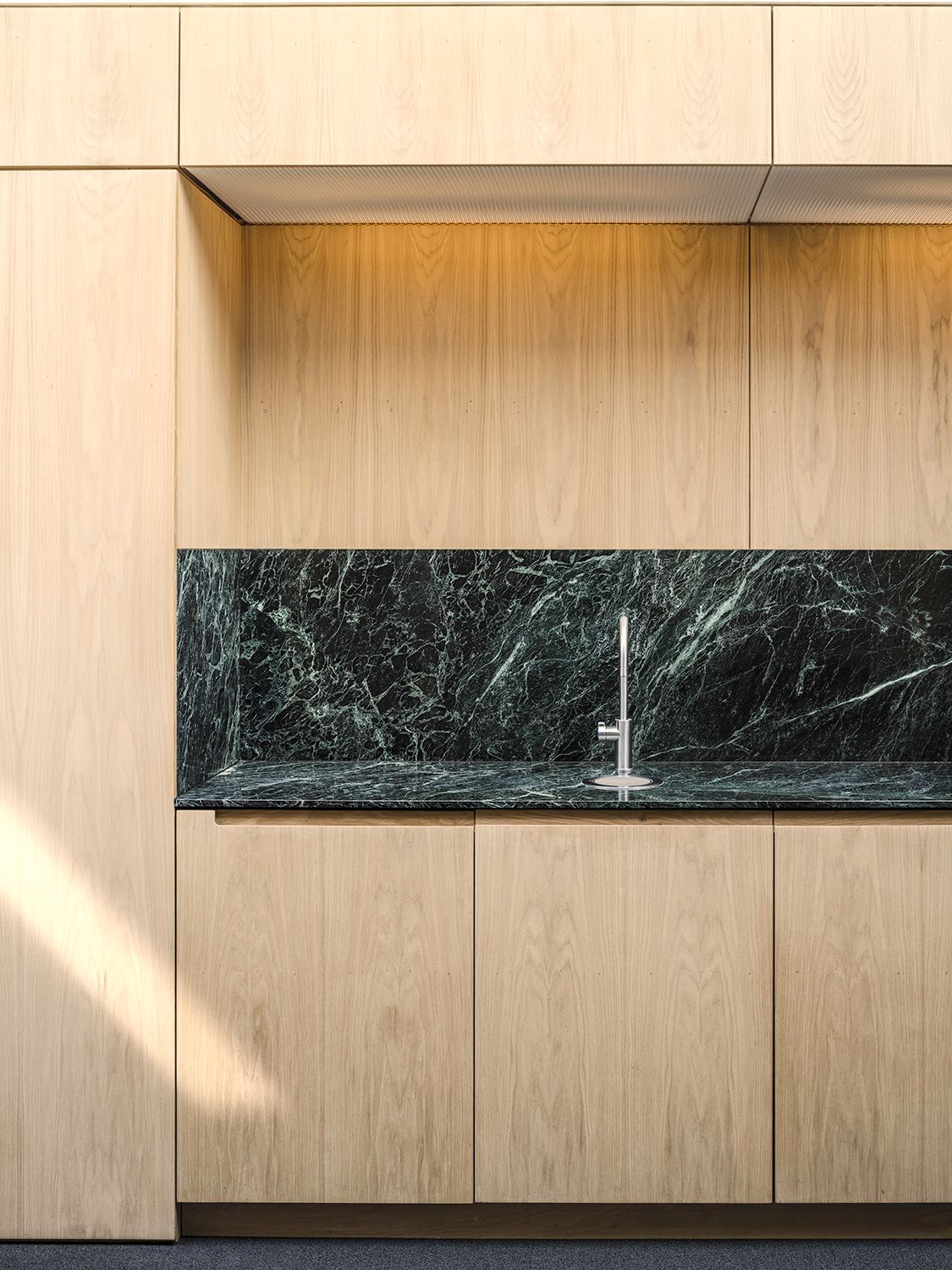
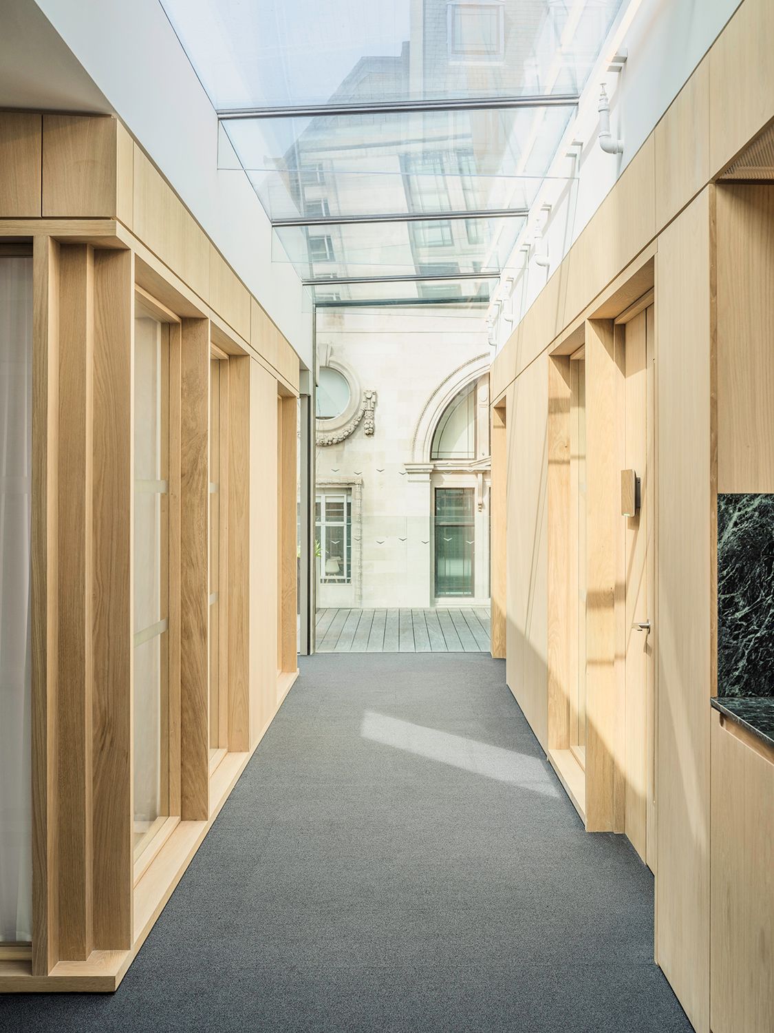
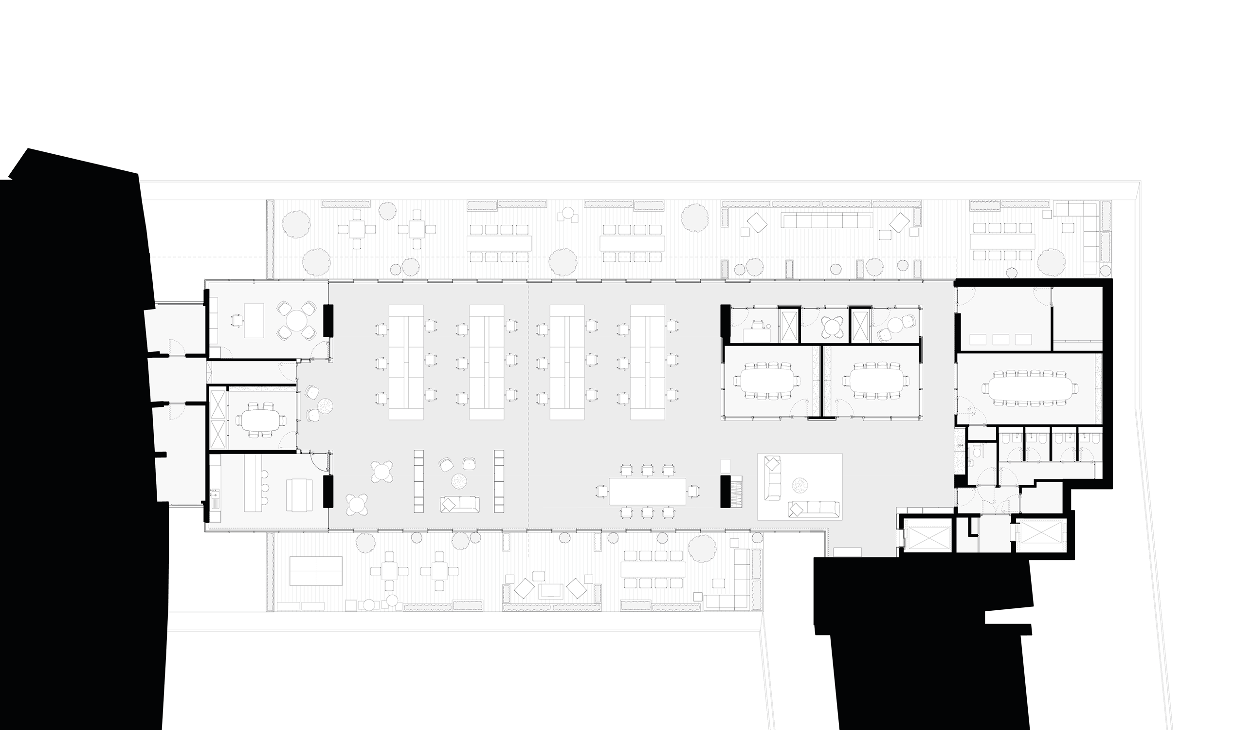
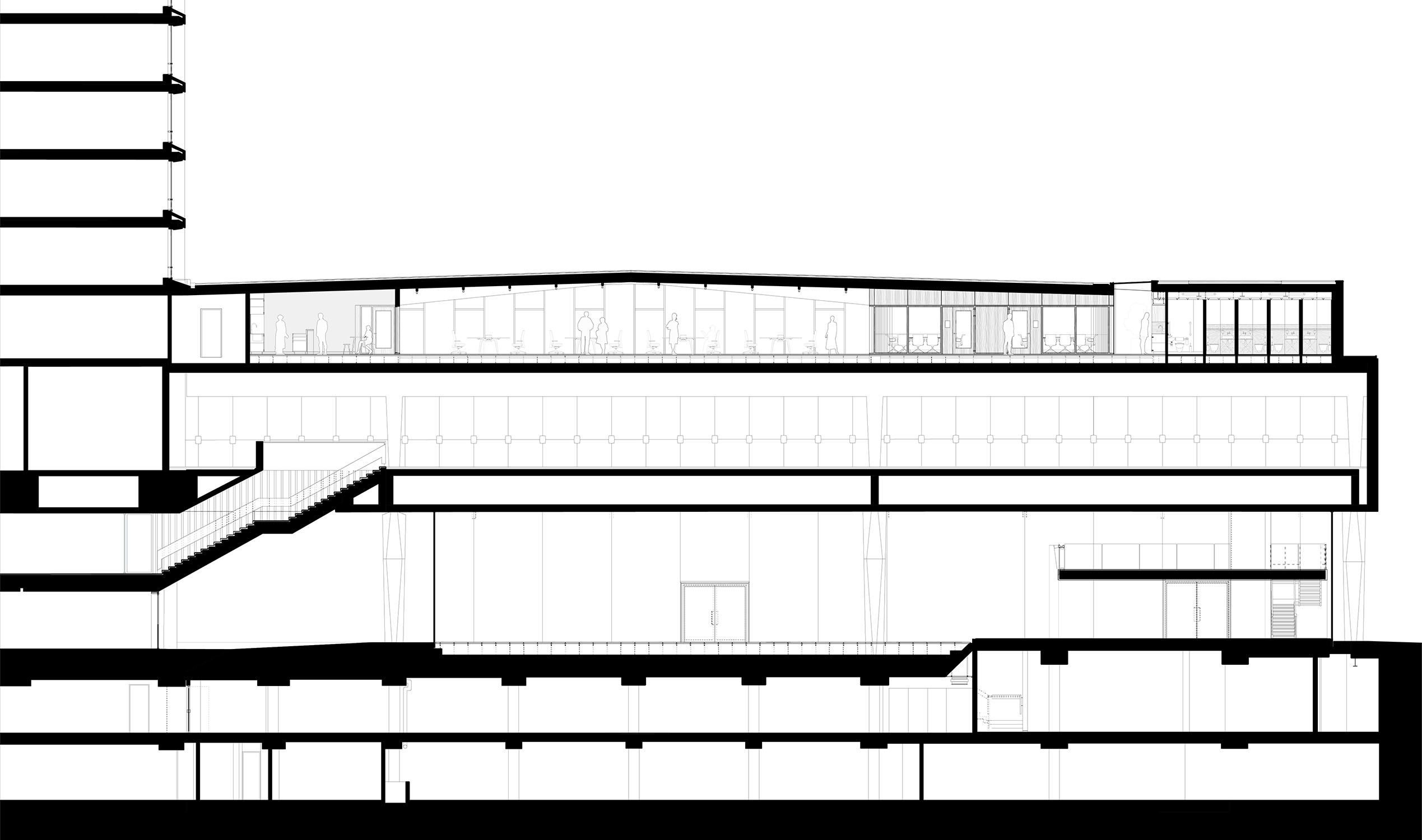
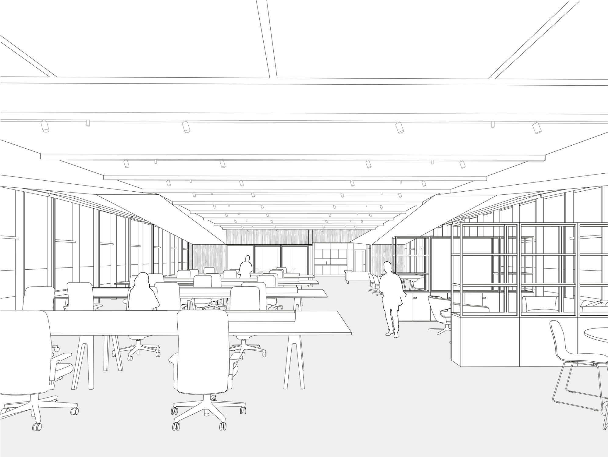
The scheme became a research piece for us, demonstrating the application of a brief that evolved – in part due the covid pandemic – from commercial motivations through to a much stronger agenda about staff wellbeing. A central question was how to retain the integrity of the large, open-plan space. Kajima wanted to preserve some of the characteristic rituals of Japanese – and European – business life with a boardroom, cellular offices and meet-and-greet space, but acknowledged a growing need for informality and co-working.
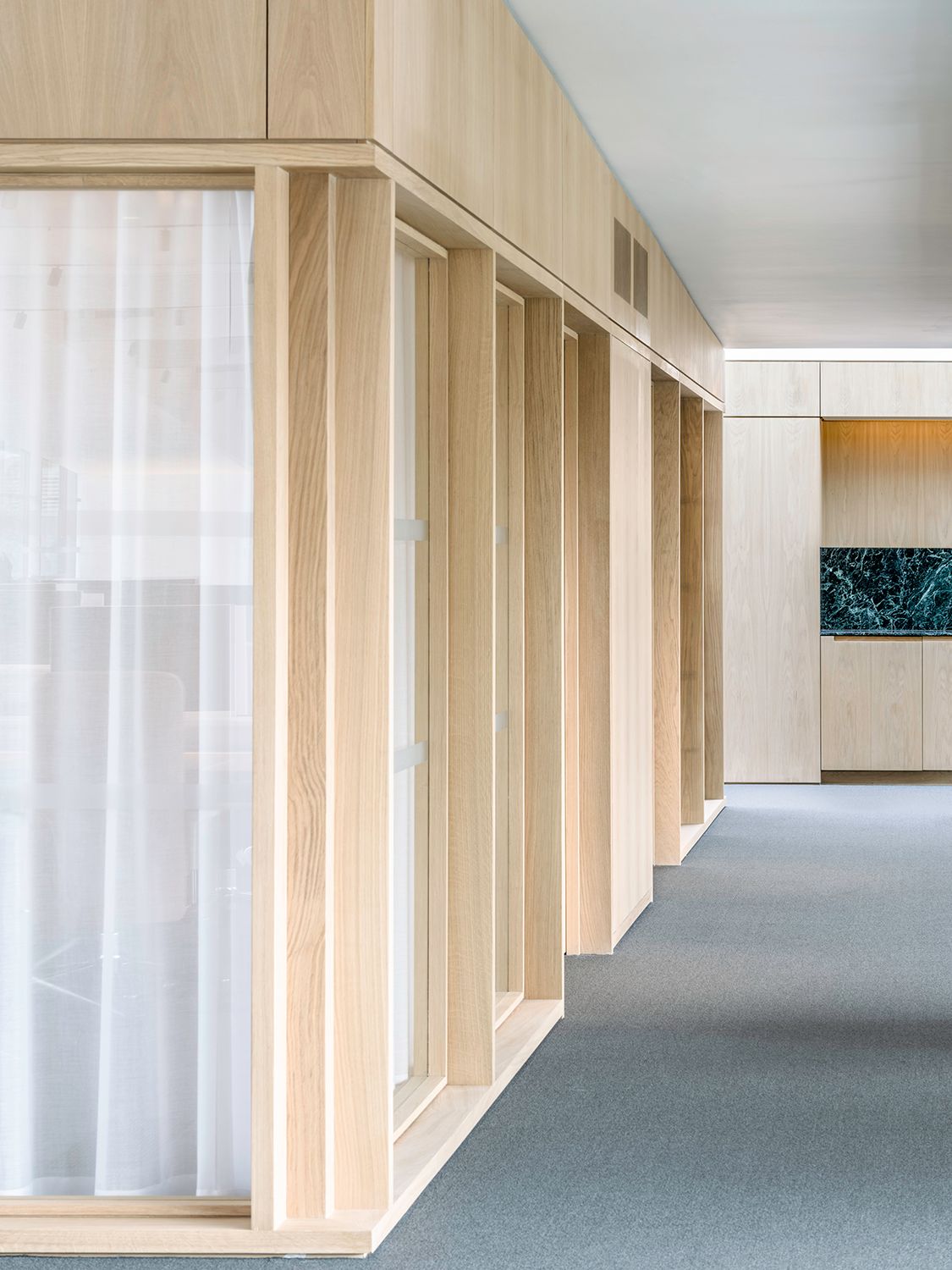
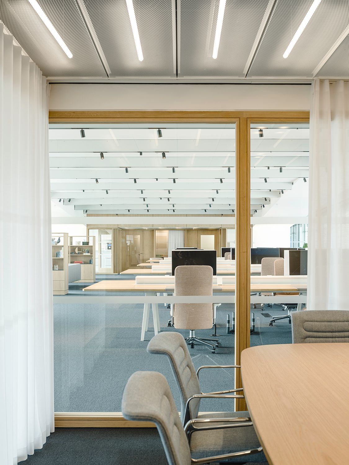
The span is held up by four blade columns, and we kept the space between these uninterrupted as a fluid landscape of desks and informal meeting places. Cellular spaces are placed at the extreme ends of the span and, taking our lead from modernist plan-forms – a meeting room island inserted as an object within it.This modernist interior is minimalist, yet still rich in materials. We designed room dividers, credenzas and coffee tables to slot into the space as pieces of bespoke, precision-detailed joinery, with book-matched oak veneers.
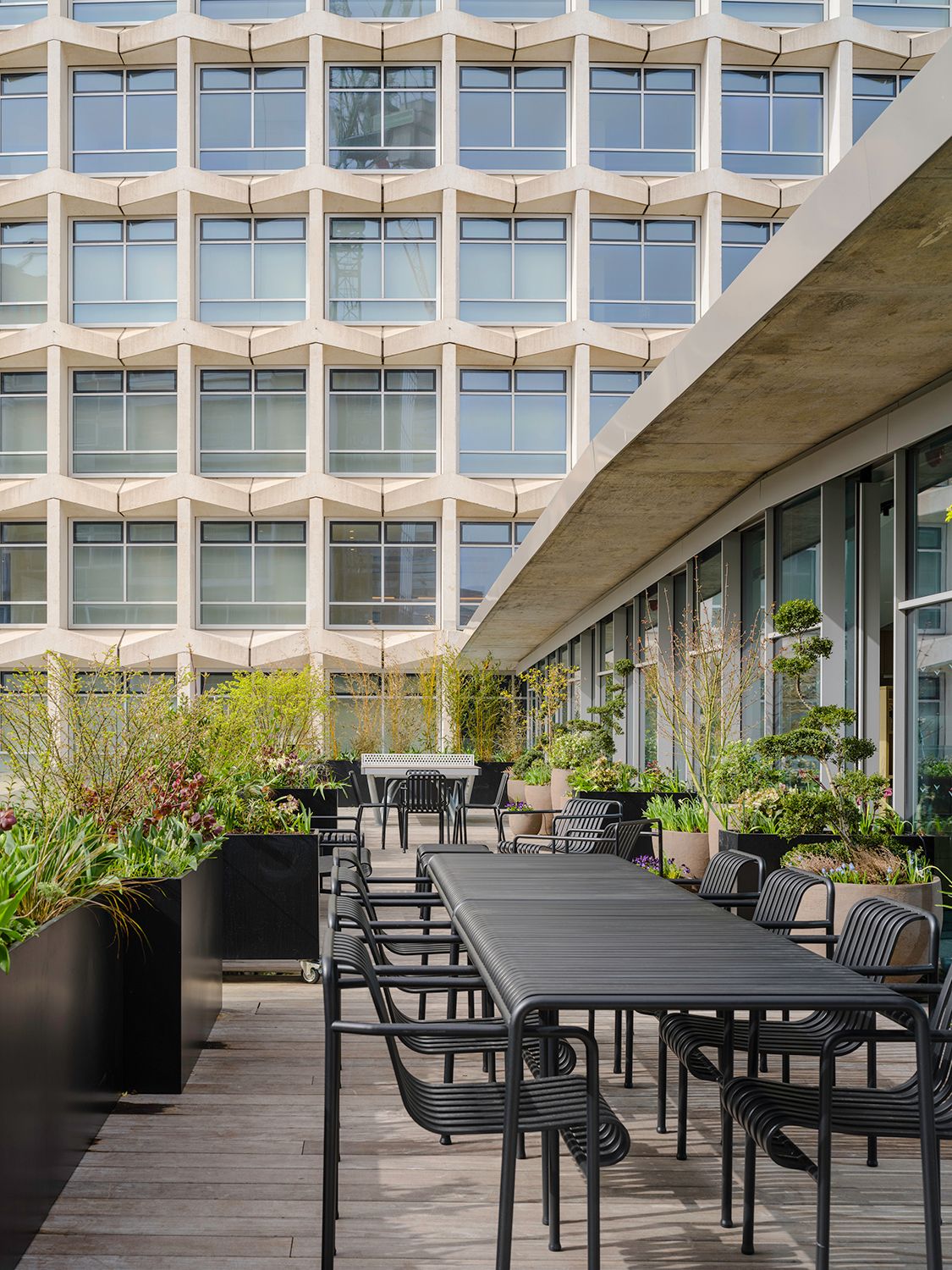
These are softened with a tertiary layer of textiles - upholstered furniture, and curtains to screen the meeting rooms. The terraces to either side of the main space are integral to the design, planted and furnished to give an alternative setting for work, meetings or breakout. The terrace promote a sense of wellbeing from within the studio space as well as providing generous external amenity spaces.
Client: Kajima Europe Planning consultant: Gerald Eve Cost consultant: Gardiner & Theobald Lighting designers: Pritchard Themis Services engineers: Sweco Acoustics engineers: Sandy Brown Approved inspector: Bureau Veritas Building Control Main contractor: Atlas Commercial Limited
